A New Ink

“She would be half a planet away, floating in a turquoise sea, dancing by moonlight to flamenco guitar.”
― Janet Fitch, White Oleander

I try to avoid buying stuff that isn’t necessary. I try to avoid impulse purchases. Sometimes I can’t help myself.

For a long time I’ve been looking for a certain color of fountain pen ink. Years ago, A friend gave me a sample once of Caran d’Ache Caribbean Sea. It was the color I was looking for, as close as I had seen. It’s the greenish turquoise color that a shallow, clear, tropical sea can get, from a certain angle. Here’s a photo that shows the color I was looking for:

Greenish Turquoise

Unfortunately, before I could buy a whole bottle, Caran d’Ache discontinued the ink. That was several years ago and since that time I have been looking for a replacement – and have tried a few. There are a lot of turquoise inks out there – but most tend toward the blue end of the spectrum. The closest so far were a couple of Diamine inks… Marine and Steel Blue.

The other day, I was surfing the net, looking at inks, when I discovered the Pilot had come out with three new colors of their Iroshizuku ink line. Iroshizuku inks are wonderful, and come in an amazing bottle – but are pretty damn pricey. But one of the three new inks was a greenish turquoise… that looked like exactly what I was looking for… and I couldn’t resist. A few clicks on the internet and a bottle of sui-gyoku iroshizuku ink was on the way to my house.

I like it. It’s the greenish turquoise I’ve been looking for. It still doesn’t quite have the luminosity of a tropical ocean… but I don’t think that’s possible in a dye mix that designed to be spread on paper. So I guess my quest for that-certain-color has been slaked for a little while.

I keep an ink journal with swatches and writing samples (done with a dip pen) of the inks I have in my inventory. Here’s a photo of the page with the sui-gyoku.

Iroshizuku sui-gyoku ink from my ink journal.

The Quick Brown Fox Jumps Over The Lazy Dog

“That’s what careless words do. They make people love you a little less.”
― Arundhati Roy, The God of Small Things

Parker “51” loaded with Pilot Iroshizuki Syo-Ro ink

There are so many important things to do in life – so many rewarding activities that help you and help others and make the world a better place. For a long while today, I didn’t do that – I worked on my fountain pen Ink Catalog – probably as useless an activity as there is (though I’ll probably take photos and post them here). So I took an 8 1/2 x 11 sketchbook and put two ink samples on each page. First, I use a Q-tip to swab out a patch of color – then I use a dip pen to write out a writing sample.

Of course I write out, “The quick brown fox jumps over the lazy dog,” because it is the only phrase I know that has all 26 letters. I thought about this – what other phrases there are. As you know there is this interweb thing – and when you type in the phrase – you get way, way too much information. I looked over a few pages of phrases and typed out my favorites.

A sentence using all the letters in the alphabet is called a pangram (from the Greek for “every letter”). “The quick brown fox jumps over the lazy dog” is the most famous pangram, but there are many others. My favorite may be “the five boxing wizards jump quickly,” which is four letters shorter.

Here is a self-descriptive pangram:

“This pangram lists four a’s, one b, one c, two d’s, twenty-nine e’s, eight f’s, three g’s, five h’s, eleven i’s, one j, one k, three l’s, two m’s, twenty-two n’s, fifteen o’s, one p, one q, seven r’s, twenty-six s’s, nineteen t’s, four u’s, five v’s, nine w’s, two x’s, four y’s, and one z.”

Perfect Pangram – one that only uses 26 letters – of course it is impossible unless you use abbreviations or archaic words:

Mr. Jock, TV quiz PhD., bags few lynx.

GQ’s oft lucky whiz Dr. J, ex-NBA MVP

Cwm fjord bank glyphs vext quiz
This one uses some pretty archaic words; translates to “Carved symbols in a mountain hollow on the bank of an inlet irritated an eccentric person.”

I looked through a lot of these and discovered my favorite – Sphinx of black quartz, judge my vow.
It supposedly was used by Adobe InDesign to display font samples. (29 letters). I’m going to have to work on memorizing this one – and use in addition to/instead of “The quick brown fox…”

Here are a bunch more – collected across the internet for your entertainment:

Waltz, nymph, for quick jigs vex Bud.

Pack my box with five dozen liquor jugs.

Glib jocks quiz nymph to vex dwarf.

Jackdaws love my big sphinx of quartz.

The view boxing wizards jump quickly.

How vexingly quick daft zebras jump!

Quick zephyrs blow, vexing daft Jim.

Two driven jocks help fax my big quiz.

The jay, pig, fox, zebra and my wolves quack!

Sympathizing would fix Quaker objectives.

A wizard’s job is to vex chumps quickly in fog.

Watch “Jeopardy!”, Alex Trebek’s fun TV quiz game.

By Jove, my quick study of lexicography won a prize!

Waxy and quivering, jocks fumble the pizza.

The quick onyx goblin jumps over the lazy dwarf

How razorback-jumping frogs can level six piqued gymnasts!

Cozy lummox gives smart squid who asks for job pen

Amazingly few discotheques provide jukeboxes

A waxy gent chuckled over my fab jazzy quips.

Platinum #3776 Century Urushi Maki-e

“We must powder our wigs; that is why so many poor people have no bread.”

― Jean-Jacques Rousseau

Platinum #3776 Century Urushi Maki-e

I only have a few days left before I retire. I didn’t want any celebration or fuss – I simply wanted to not show up on the appointed and anointed day. But a handful of coworkers chipped in (the days when a company rewarded someone that has come to work for over two decades with a gold watch or something are long, long over) and bought me a present.

It was a pen, a Japanese Platinum #3776 Century Urushi Maki-e.

I was speechless. This is not a cheap gift. And it was so thoughtful – If you gave me a blank check and told me to buy myself something, regardless of cost – this would have been it (I realize there are much, much more expensive Maki-e pens out there – but I would be scared to even touch something like that). I love the cigar-shaped pens. I love the gold Japanese nibs (Pilot is supposed to be smoothest, Sailor the most feedback – but Platinum is right in the middle) – this one is a medium, which means it is very smooth and a joy to write with. It even has a technological advantage – a slip-and-seal cap that is supposed to keep the nib wet for two years. I find that claim a bit much – but an instant starting pen is important to me and this one is.

The Urushi lacquer and Maki-e artwork is stunning (it is the modern “screened” Maki-e instead of hand drawn – but I don’t care). It is the Sansui design of boats, rocks, and flowering plants… with some cool gold birds flying across the top and, best of all, a gorgeous blood-red rising sun peeking out from the clip. The nib is a big #5 14K gold, with a simple design and a stylized Mount Fuji straddling the tines (the reason the pen is called #3776 is that is the height of Mount Fuji in meters). I never really thought about a pen like that – I never would be able to spend that kind of money to myself. I’ve inked it up with some Pilot Iroshizuku Kon-Peki blue ink and can’t keep my hands off it.

It was very emotional for me to get such a thoughtful gift. I know it’s only “a thing” but it is an exquisite thing given as a gift, as a remembrance.

Ink

“Ink, a Drug.”

― Vladimir Nabokov, Bend Sinister

My new ink shelf, with RGB LED lighting.

A few years ago, I bought a little wooden shelf unit at a thrift store for a couple dollars and mounted it on the wall above my secretary desk – which I mostly use for handwriting.

I’ve been reorganizing my office room and decided to use the shelf to store my fountain pen inks. It was about the right size and in a good spot. As I looked at it I thought it would look good with some illumination – so I went onto the internet and bought a one meter RGB LED light strip. It was from one of those cheap places so I had to wait a long time for it to arrive on a slow boat from you-know-where – but I was in no hurry.

When it arrived I drilled some holes in the shelf and the wall and ran a USB cord up to the shelf. I glued the strip down behind the ink bottles (I tried behind and in front – behind looked better) and there is was. The strip does blink and flash and rotate colors and all that stuff (It comes with a little remote) but I usually leave it shining a more or less “white” light. I thought that the colors of the ink would show but they are way too opaque and appear black.

Still I was very happy with how it turned out.

The beautiful fantastic Pilot Iroshizuku Ink bottles.

My favorite inks and, especially, ink bottles are the Pilot Iroshizuku ink from Japan. It is expensive, but I save the bottles and reuse them. When I have something I want to accomplish I will give myself the reward of a bottle of Iroshizuku if I meet the goal, as an incentive. I love the little well in the bottom to help get the last bit of ink out. The glass is heavy and really attractive.

Another bottle of Iroshizuku plus a couple bottles of vintage Waterman ink.

Down on the end of the shelf are four bottles of vintage Waterman ink. I bought these in a box at an estate sale for a dollar. They are old (the blue ink in the photo above is called “Florida Blue” has a new name now – “Serenity Blue”) but it seems to still work well. Very well-behaved ink.

Vintage Sheaffer Skrip ink bottle, with some green ink in the well.
Vintage Sheaffer Skrip ink bottle. There is a little well on the lip to hold ink when the bottle is almost empty.

If you look on the shelf you can see a couple of vintage Sheaffer Skrip ink bottles. I’m always looking for these at antique stores and such. The ink is long gone, but I refill them with modern ink from boring bottles. What is cool about these vintage bottles is that they have a little well along the lip of the bottle. When the bottle is almost empty, you tip the bottle up to fill the well. You can get the tip of a fountain pen in there and thereby use every drop.

It doesn’t work as well as it should (the well is too small for some modern large-nibbed fountain pens) but I still like the idea and history.

syo-ro

“I take pride in using fountain pens. They represent craftsmanship and a love of writing. Biros, on the other hand, represent the throwaway culture of modern society, which exists on microwave ready-meals and instant coffee.”
Fennel Hudson, A Writer’s Year – Fennel’s Journal – No. 3


Pilot iroshizuku syo-ro ink (pine tree dew or gray turquoise)

People give me Amazon Gift Cards for Christmas and my birthday – which is a good thing because I can’t hope for anyone to understand my odd and ridiculous tastes. The final box I ordered for my birthday arrived – taking over a month, probably because it was shipped from Japan.

It was a bottle of Pilot brand iroshizuku ink, in the syo-ro color, which is described as pine tree dew or gray turquoise.

It’s a fairly expensive ink, but that’s the idea of a gift card anyway – buy something you really like, but would be too dear for you to buy for yourself.

I wanted a new go-to color of ink and pored over the iroshizuku color charts to try and find the one I like the best – a sisyphean task. I wanted a dark color with subtle shading.

You see, once you start writing with fountain pens, you realize the quality of the writing experience depends on three primary variables. Everybody talks about the pen – people pay big money for fine pens. But the paper you write on is equally important. Some pens do better with some papers. And finally there is the ink.

Not only the color, but the qualities of the ink. Some ink works better in some pens, and the relationship with the ink and the paper is very complex.

Now I had my ink after its long journey on a slow boat. I love the bottle. Its a heavy, curved piece of glass art, with a cool little well at the bottom, to help get the last drops out.

After a little thought, I cleaned out my favorite Parker “51” and loaded it up. The ink and pen go together perfectly. It is a sweet luxury.

Parker “51” loaded with iroshizuki syo-ro ink

Written In Invisible Ink

“The pages are still blank, but there is a miraculous feeling of the words being there, written in invisible ink and clamoring to become visible”
― Vladimir Nabokov

Sheaffer Snorkel snorkel extended - waiting for new ink

Sheaffer Snorkel
snorkel extended – waiting for new ink

“As writers we live life twice, like a cow that eats its food once and then regurgitates it to chew and digest it again. We have a second chance at biting into our experience and examining it. …This is our life and it’s not going to last forever. There isn’t time to talk about someday writing that short story or poem or novel. Slow down now, touch what is around you, and out of care and compassion for each moment and detail, put pen to paper and begin to write.”
― Natalie Goldberg

Fake

You all know (or should know) that I have a weakness for and love of fountain pens. I am primarily a “user” rather than a “collector” – but still appreciate an aged and well-done writing instrument, as long as it has a nib.

I was looking at Amazon.com for some stuff and, off in the corner, I saw an ad that caught my eye. Usually I ignore web ads, but this one seemed aimed right at me.

It looked like The Parker Pen company, the venerable company that over the years has produced such legendary and wonderful fountain pens such as the Vacumatic and the Parker “51” has come up with a new pen – maybe some sort of advanced nib, or a revolutionary filling system. I was stoked.

So I clicked through the ad to the Parker Ingenuity, one of their “5th ink technology” pens. Something didn’t quite look right. So I did some digging and research and it didn’t take long for me to figure it out.

This wasn’t a fountain pen at all. It’s like a felt pen, with a metal hood stamped around it to make it look like a fountain pen.The actual writing surface is replaced with a new refill. It even has non-functional ribs to look like the ridges on a fountain pen feed. A typical model costs a little bit under two hundred dollars. It is obviously aimed at people that want to look like they carry a fountain pen – they want the cachet – but that don’t want inky fingers.

I know that you are going to get ink on your hands or worse when you carry a fountain pen. A pen with a nib is considered a “controlled leak” and I’ve learned to wipe off the pen and clean the inside of the cap when a pen has been lugged around where it can get a shock and shake ink out into the cap. Flying is a real problem – the reduced air pressure can cause a pen to spew ink (I carry an empty pen, an airtight case, and extra cartridges).

So I fully understand someone that wants to carry, for example, a rollerball – sometimes I think of it myself – though I say no… it seems unclean somehow. What bugs me is that they make it look like a fountain pen. A triangle with a slit in it is not a nib – a good nib is a wonderful piece of design, engineering, and manufacture. It is a delicate mechanism of steel, gold, and iridium designed to deliver a carefully controlled stream of ink in a smooth flow to a piece of paper.

A felt pen is useful and deserving of its existence – but don’t try to hide it behind a stamped piece of sheetmetal.

Oh, one other point – I am not a fan of pens that have metal sections – the part right in back of the nib, the place where your fingers grip. I don’t like the feel of cold chrome. Warm plastic, rubber, or ebonite is a better writing grip.

Now that I’ve ranted a bit… if anyone actually wanted to buy me one of those… well, that would be different.

It would be a gift.

Pen Porn

We all have our addictions. I don’t think you can get away from them. I don’t think you want to get away from all of them.

Addictions are what make life worth living. Giving in to them is the spice that makes it worth getting out of bed in the morning (unless, of course, you are addicted to sleeping late). The trick is to choose your addictions.

There are addictions that are always bad. You see these on Intervention. Crack, for example… I think I can say that this is an addiction that is always bad. So don’t give in to your inner crackhead, channel him somewhere else.

Then there are addictions that might not be always bad, but are inappropriate, overly embarrassing, or catastrophic for you, personally. If I became addicted to anything overly expensive – say fast cars, supermodels, or gambling – I would be in big trouble.

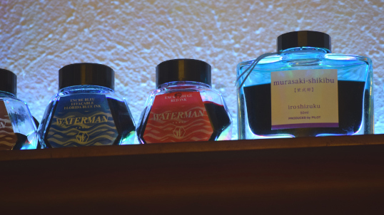
So being the useless geek that I am, I tend toward useless, geeky addictions. One of the most obvious ones I’ve picked up lately is a rather silly obsession with fountain pens. I’ll talk more about that later, but today we will simply take a look at today’s single fix – and table the larger questions for another day.

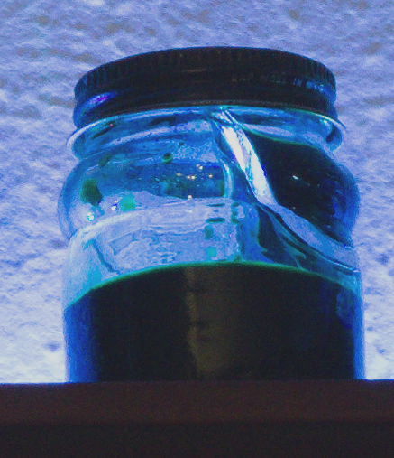
Over that Internet thing… from that online commerce site that sort of rhymes with flea spray… I bought a cheap macro lens adapter for my camera. I did this for the sad purpose of being able to wallow in my stupid addiction in one more ridiculous performance method – I want to take pictures of pens.

Pen Porn.

And we’ll leave it at that. Judge if you must, it makes no difference to me. It is an addiction.

It came in the mail – an unmarked, brown paper package. I eagerly unwrapped my simple purchase, stuck it on the front of the lens, and put together a quick assemblage of tripod, desk lamps, and a cut up cylinder of translucent plastic (an old cover for a stack of blank DVDs) as a light tent.

I have a lot to learn about macro photography. I have a book. I’ll get better at it. But, of course, it is porn, so quality isn’t all that important, is it?

Today, let’s take a look at three different kinds of Sheaffer Nibs.

The nib is not only the most important part of a fountain pen, to a great extent, the nib is the fountain pen. It is the critical piece of hardware that conveys the ink from the pen body and deposits it onto the paper. Most people are familiar with a nib as a curved, triangular piece of metal with a narrow slit in the middle. Look close, and you will see a little rounded tip on the end that moves over the paper.

And that’s about it. Over the long decades, however, there have been many nib innovations and variations. I’ll take some pictures later of my Parker 51’s (if this raises the hair on the back of your neck, God help you… it does mine) but today we’ll look at three examples in the history of the Sheaffer nib.

First, we have the conical Triumph Nib. This is probably my favorite nib of all time. It is as stiff as a nail, but is very smooth and reliable, and it looks cool.

Sheaffer Triumph Nib

Sheaffer Triumph Nib

This is a Sheaffer two tone, touchdown filling pen, probably from around 1950 or so. I bought this one from a grubby pile of crap under the trees at Canton, rebuilt it, and now it writes like a champ.

The Triumph Nib ruled Sheaffer’s top of the line pens until the end of the 1950’s and the emergence of the Pen For Men (I do not have a Pen For Men, or PFM, it is really the only pen I really lust after. They were not very popular when they came out and are therefore rare, collectible, and expensive today. I simply can’t afford one) and its Inlaid Nib. The Inlaid nib dominated the Sheaffer line from 1959 to the present.

Sheaffer Inlaid Nib

Sheaffer Inlaid Nib

This is a humble example of an Inlaid Nib. It is from a small Imperial from about 1965 – 1970. It is a bit different because it has a “V” shaped triangular cut-out, rather than the longer diamond shaped one. It is a small, cartridge filling pen, nothing fancy, but it writes really well. I have some orange-colored translucent ink in it, you can see a bit of ink on the nib.

Finally, we have an oddball. This is a Sheaffer “Dolphin” nib. You can see the odd hump that gives it its name. The Dolphin is simply a cheap imitation of the more tony inlaid nib. It is a design that is supposed to look like an inlaid nib, but is really an ordinary nib with a bit of plastic and metal stuck on top of it to make it look better.

Sheaffer Dolphin Nib

Sheaffer Dolphin Nib

It may be cheap, but it works fine, this pen, again, is a very smooth and reliable writer. It is a cartridge fill. Candy gave me a touchdown filling Dolphin nib desk pen from an antique store in Granbury for Father’s Day – it is waiting for me to restore it – maybe this weekend. I love touchdown filling pens.

Sheaffer Pens

Sheaffer Pens

What is a touchdown filling pen? You’ll have to wait. More porn to come.

Refilling a Varsity

I believe that we all have addictions. Trying to navigate this vale of tears without a healthy dose of irrational cravings is an impossibility. The key is to chose your addictions.

Good luck.

At any rate, one of my addictions is Fountain Pens. I have no idea why: a childhood memory? The pure gadgetry of the thing? The nerdiness? The relationship to writing? I don’t know why. I only know that I don’t fight it.

Much.

In the spectrum of Pen Collectors I am what is referred to as a USER. I don’t care about how expensive a pen is, I simply want to write with it. I don’t care about rarity, or perfect condition, or if someone in time past had their name engraved on their pen (I think this is cool, actually). My favorite thing is to find some beat up old antique caked with dried ink and desk drawer dust at Canton or some other flea market – then disassemble, clean, repair, replace, rebuild, and then, actually write with the thing.

Enter the Varsity.

Modern fountain pens do not, as a general rule, stand up to vintage writing instruments.  There are exceptions.

One interesting specimen is the Pilot Varsity. The Pilot company is a Japanese manufacturer and purveyor of fine pens that can cost thousands of dollars. (their Vanishing Point model is very popular, their expensive shit is sold under the sub-brand Namiki).

The Varsity is one of their low-end models, very low-end. It is disposable. You can find them in office supply stores or some bookstores for around three bucks each.

They even come in packs of seven different colors for about two dollars each.

The crazy thing is, they are great writers. A wet medium line, a surprisingly smooth nib, very reliable, rarely leak. If you want to give writing with a fountain pen a try, this is a great way to do it.

I like the Varsity so much, I decided it was too good to be disposable. When my blue model went dry, I decided to re-fill it.

My favorite color is a bluish-green and I decided to go there, with a slant on the green side. I chose two compatible inks: Private Reserve Spearmint and American Blue. I assembled all my tools: pen, ink, pliers, and an irrigation syringe.

Tools

Pen, ink, syringe, pliers.

I grabbed the nib with the pliers and pulled it out – it gave away with a nice firm click. The nib is the metal part of a fountain pen. It sits up against a ribbed plastic bit called a collector. This is what holds a dab of ink up next to the nib so it can go onto the paper quickly. A fountain pen is accurately described as a “Controlled Leak” – the collector is what controls that leak. In the Varsity the steel nib and black plastic collector came out of the clear body in one piece.

Easy. Much better than the method this guy uses.

I washed everything out and put some diluted green and blue ink (mostly green) into the syringe.

Pilot Varsity

Pen, nib and collector removed, cleaned out, ready for new ink.

I was a simple process to squirt the ink back into the body of the Varsity and then push the nib and collector back in. A good shove and it clicked back as it was before.

And now it writes again. I saved myself three dollars (minus the cost of the ink) but that’s not the point.

Varsity Refilled

The Varsity refilled with a sample of the ink color. My handwriting is terrible, it always has been.

Now that I think about it… I don’t actually know what the point is. Points are overrated, I guess. Aren’t they?

A junkie fix for my fountain pen addiction. Not too bad as addictions go.