A New Ink

“She would be half a planet away, floating in a turquoise sea, dancing by moonlight to flamenco guitar.”
― Janet Fitch, White Oleander

I try to avoid buying stuff that isn’t necessary. I try to avoid impulse purchases. Sometimes I can’t help myself.

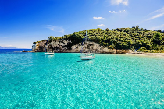
For a long time I’ve been looking for a certain color of fountain pen ink. Years ago, A friend gave me a sample once of Caran d’Ache Caribbean Sea. It was the color I was looking for, as close as I had seen. It’s the greenish turquoise color that a shallow, clear, tropical sea can get, from a certain angle. Here’s a photo that shows the color I was looking for:

Greenish Turquoise

Unfortunately, before I could buy a whole bottle, Caran d’Ache discontinued the ink. That was several years ago and since that time I have been looking for a replacement – and have tried a few. There are a lot of turquoise inks out there – but most tend toward the blue end of the spectrum. The closest so far were a couple of Diamine inks… Marine and Steel Blue.

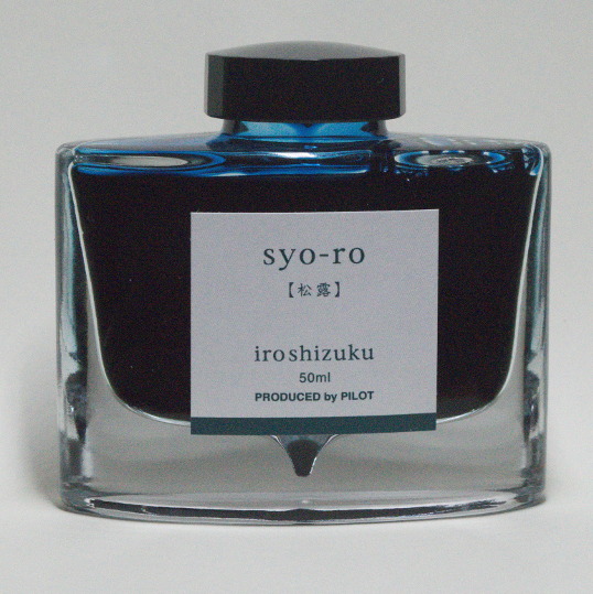
The other day, I was surfing the net, looking at inks, when I discovered the Pilot had come out with three new colors of their Iroshizuku ink line. Iroshizuku inks are wonderful, and come in an amazing bottle – but are pretty damn pricey. But one of the three new inks was a greenish turquoise… that looked like exactly what I was looking for… and I couldn’t resist. A few clicks on the internet and a bottle of sui-gyoku iroshizuku ink was on the way to my house.

I like it. It’s the greenish turquoise I’ve been looking for. It still doesn’t quite have the luminosity of a tropical ocean… but I don’t think that’s possible in a dye mix that designed to be spread on paper. So I guess my quest for that-certain-color has been slaked for a little while.

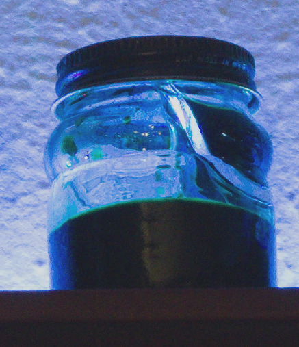
I keep an ink journal with swatches and writing samples (done with a dip pen) of the inks I have in my inventory. Here’s a photo of the page with the sui-gyoku.

Iroshizuku sui-gyoku ink from my ink journal.

Ink

“Ink, a Drug.”

― Vladimir Nabokov, Bend Sinister

My new ink shelf, with RGB LED lighting.

A few years ago, I bought a little wooden shelf unit at a thrift store for a couple dollars and mounted it on the wall above my secretary desk – which I mostly use for handwriting.

I’ve been reorganizing my office room and decided to use the shelf to store my fountain pen inks. It was about the right size and in a good spot. As I looked at it I thought it would look good with some illumination – so I went onto the internet and bought a one meter RGB LED light strip. It was from one of those cheap places so I had to wait a long time for it to arrive on a slow boat from you-know-where – but I was in no hurry.

When it arrived I drilled some holes in the shelf and the wall and ran a USB cord up to the shelf. I glued the strip down behind the ink bottles (I tried behind and in front – behind looked better) and there is was. The strip does blink and flash and rotate colors and all that stuff (It comes with a little remote) but I usually leave it shining a more or less “white” light. I thought that the colors of the ink would show but they are way too opaque and appear black.

Still I was very happy with how it turned out.

The beautiful fantastic Pilot Iroshizuku Ink bottles.

My favorite inks and, especially, ink bottles are the Pilot Iroshizuku ink from Japan. It is expensive, but I save the bottles and reuse them. When I have something I want to accomplish I will give myself the reward of a bottle of Iroshizuku if I meet the goal, as an incentive. I love the little well in the bottom to help get the last bit of ink out. The glass is heavy and really attractive.

Another bottle of Iroshizuku plus a couple bottles of vintage Waterman ink.

Down on the end of the shelf are four bottles of vintage Waterman ink. I bought these in a box at an estate sale for a dollar. They are old (the blue ink in the photo above is called “Florida Blue” has a new name now – “Serenity Blue”) but it seems to still work well. Very well-behaved ink.

Vintage Sheaffer Skrip ink bottle, with some green ink in the well.
Vintage Sheaffer Skrip ink bottle. There is a little well on the lip to hold ink when the bottle is almost empty.

If you look on the shelf you can see a couple of vintage Sheaffer Skrip ink bottles. I’m always looking for these at antique stores and such. The ink is long gone, but I refill them with modern ink from boring bottles. What is cool about these vintage bottles is that they have a little well along the lip of the bottle. When the bottle is almost empty, you tip the bottle up to fill the well. You can get the tip of a fountain pen in there and thereby use every drop.

It doesn’t work as well as it should (the well is too small for some modern large-nibbed fountain pens) but I still like the idea and history.

syo-ro

“I take pride in using fountain pens. They represent craftsmanship and a love of writing. Biros, on the other hand, represent the throwaway culture of modern society, which exists on microwave ready-meals and instant coffee.”
Fennel Hudson, A Writer’s Year – Fennel’s Journal – No. 3


Pilot iroshizuku syo-ro ink (pine tree dew or gray turquoise)

People give me Amazon Gift Cards for Christmas and my birthday – which is a good thing because I can’t hope for anyone to understand my odd and ridiculous tastes. The final box I ordered for my birthday arrived – taking over a month, probably because it was shipped from Japan.

It was a bottle of Pilot brand iroshizuku ink, in the syo-ro color, which is described as pine tree dew or gray turquoise.

It’s a fairly expensive ink, but that’s the idea of a gift card anyway – buy something you really like, but would be too dear for you to buy for yourself.

I wanted a new go-to color of ink and pored over the iroshizuku color charts to try and find the one I like the best – a sisyphean task. I wanted a dark color with subtle shading.

You see, once you start writing with fountain pens, you realize the quality of the writing experience depends on three primary variables. Everybody talks about the pen – people pay big money for fine pens. But the paper you write on is equally important. Some pens do better with some papers. And finally there is the ink.

Not only the color, but the qualities of the ink. Some ink works better in some pens, and the relationship with the ink and the paper is very complex.

Now I had my ink after its long journey on a slow boat. I love the bottle. Its a heavy, curved piece of glass art, with a cool little well at the bottom, to help get the last drops out.

After a little thought, I cleaned out my favorite Parker “51” and loaded it up. The ink and pen go together perfectly. It is a sweet luxury.

Parker “51” loaded with iroshizuki syo-ro ink