Never pick a fight with people who buy ink by the barrel. —-Mark Twain
During the pandemic I was on a zoom call with my “Difficult Book Reading Club” (I was never able to work from home, my home Zoom calls were all personal) discussing… The Brothers Karamazov I think, when one of the participants, looking out through my camera said, “Bill, what the Hell is that thing on the wall behind you.” I had to think for a bit, and then realized it was my ink shelf.
I have been a fountain pen enthusiast for a long time. I have a modest collection of user-grade pens… I may write about some of them (you are forewarned). But pens are only one-third of the equation. Equally important is the paper – even something as famed as a Moleskine notebook is actually bad for fountain pen writing. Bleed-through to the opposite page and feathering are the two biggest faults.
The third part is, of course, the ink. It’s fascinating how some pens work better with some inks and the combinations may require a certain paper for optimal scribbling.
Over the last few years I have been accumulating ink with even more fervor than I have been acquiring writing instruments. Trying to think of a way to store and display my favorite go-to inks I came up with a shelf near my writing desk. The ink looked surprisingly bland there on the simple wooden shelf, so I drilled two holes in the wall, ran a USB cable behind the drywall to a power brick and stuck up an LED string behind the bottles of ink.
It came with a remote – but I have it on a permanent RGB color cycling pattern. It serves as a great nightlight too. It’s been there so long, I don’t even notice it until my pen runs dry – but I guess the constant pulsing and color-changing looks odd in the background of a Zoom call.
“She would be half a planet away, floating in a turquoise sea, dancing by moonlight to flamenco guitar.” ― Janet Fitch, White Oleander
I try to avoid buying stuff that isn’t necessary. I try to avoid impulse purchases. Sometimes I can’t help myself.
For a long time I’ve been looking for a certain color of fountain pen ink. Years ago, A friend gave me a sample once of Caran d’Ache Caribbean Sea. It was the color I was looking for, as close as I had seen. It’s the greenish turquoise color that a shallow, clear, tropical sea can get, from a certain angle. Here’s a photo that shows the color I was looking for:
Greenish Turquoise
Unfortunately, before I could buy a whole bottle, Caran d’Ache discontinued the ink. That was several years ago and since that time I have been looking for a replacement – and have tried a few. There are a lot of turquoise inks out there – but most tend toward the blue end of the spectrum. The closest so far were a couple of Diamine inks… Marine and Steel Blue.
The other day, I was surfing the net, looking at inks, when I discovered the Pilot had come out with three new colors of their Iroshizuku ink line. Iroshizuku inks are wonderful, and come in an amazing bottle – but are pretty damn pricey. But one of the three new inks was a greenish turquoise… that looked like exactly what I was looking for… and I couldn’t resist. A few clicks on the internet and a bottle of sui-gyoku iroshizuku ink was on the way to my house.
I like it. It’s the greenish turquoise I’ve been looking for. It still doesn’t quite have the luminosity of a tropical ocean… but I don’t think that’s possible in a dye mix that designed to be spread on paper. So I guess my quest for that-certain-color has been slaked for a little while.
I keep an ink journal with swatches and writing samples (done with a dip pen) of the inks I have in my inventory. Here’s a photo of the page with the sui-gyoku.
“That’s what careless words do. They make people love you a little less.” ― Arundhati Roy, The God of Small Things
Parker “51” loaded with Pilot Iroshizuki Syo-Ro ink
There are so many important things to do in life – so many rewarding activities that help you and help others and make the world a better place. For a long while today, I didn’t do that – I worked on my fountain pen Ink Catalog – probably as useless an activity as there is (though I’ll probably take photos and post them here). So I took an 8 1/2 x 11 sketchbook and put two ink samples on each page. First, I use a Q-tip to swab out a patch of color – then I use a dip pen to write out a writing sample.
Of course I write out, “The quick brown fox jumps over the lazy dog,” because it is the only phrase I know that has all 26 letters. I thought about this – what other phrases there are. As you know there is this interweb thing – and when you type in the phrase – you get way, way too much information. I looked over a few pages of phrases and typed out my favorites.
A sentence using all the letters in the alphabet is called a pangram (from the Greek for “every letter”). “The quick brown fox jumps over the lazy dog” is the most famous pangram, but there are many others. My favorite may be “the five boxing wizards jump quickly,” which is four letters shorter.
Here is a self-descriptive pangram:
“This pangram lists four a’s, one b, one c, two d’s, twenty-nine e’s, eight f’s, three g’s, five h’s, eleven i’s, one j, one k, three l’s, two m’s, twenty-two n’s, fifteen o’s, one p, one q, seven r’s, twenty-six s’s, nineteen t’s, four u’s, five v’s, nine w’s, two x’s, four y’s, and one z.”
Perfect Pangram – one that only uses 26 letters – of course it is impossible unless you use abbreviations or archaic words:
Mr. Jock, TV quiz PhD., bags few lynx.
GQ’s oft lucky whiz Dr. J, ex-NBA MVP
Cwm fjord bank glyphs vext quiz This one uses some pretty archaic words; translates to “Carved symbols in a mountain hollow on the bank of an inlet irritated an eccentric person.”
I looked through a lot of these and discovered my favorite – Sphinx of black quartz, judge my vow. It supposedly was used by Adobe InDesign to display font samples. (29 letters). I’m going to have to work on memorizing this one – and use in addition to/instead of “The quick brown fox…”
Here are a bunch more – collected across the internet for your entertainment:
Waltz, nymph, for quick jigs vex Bud.
Pack my box with five dozen liquor jugs.
Glib jocks quiz nymph to vex dwarf.
Jackdaws love my big sphinx of quartz.
The view boxing wizards jump quickly.
How vexingly quick daft zebras jump!
Quick zephyrs blow, vexing daft Jim.
Two driven jocks help fax my big quiz.
The jay, pig, fox, zebra and my wolves quack!
Sympathizing would fix Quaker objectives.
A wizard’s job is to vex chumps quickly in fog.
Watch “Jeopardy!”, Alex Trebek’s fun TV quiz game.
By Jove, my quick study of lexicography won a prize!
Waxy and quivering, jocks fumble the pizza.
The quick onyx goblin jumps over the lazy dwarf
How razorback-jumping frogs can level six piqued gymnasts!
Cozy lummox gives smart squid who asks for job pen
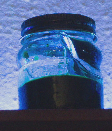
I’ve been reorganizing my office room and decided to use the shelf to store my fountain pen inks. It was about the right size and in a good spot. As I looked at it I thought it would look good with some illumination – so I went onto the internet and bought a one meter RGB LED light strip. It was from one of those cheap places so I had to wait a long time for it to arrive on a slow boat from you-know-where – but I was in no hurry.
When it arrived I drilled some holes in the shelf and the wall and ran a USB cord up to the shelf. I glued the strip down behind the ink bottles (I tried behind and in front – behind looked better) and there is was. The strip does blink and flash and rotate colors and all that stuff (It comes with a little remote) but I usually leave it shining a more or less “white” light. I thought that the colors of the ink would show but they are way too opaque and appear black.
Still I was very happy with how it turned out.
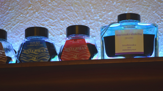
The beautiful fantastic Pilot Iroshizuku Ink bottles.
My favorite inks and, especially, ink bottles are the Pilot Iroshizuku ink from Japan. It is expensive, but I save the bottles and reuse them. When I have something I want to accomplish I will give myself the reward of a bottle of Iroshizuku if I meet the goal, as an incentive. I love the little well in the bottom to help get the last bit of ink out. The glass is heavy and really attractive.
Another bottle of Iroshizuku plus a couple bottles of vintage Waterman ink.
Down on the end of the shelf are four bottles of vintage Waterman ink. I bought these in a box at an estate sale for a dollar. They are old (the blue ink in the photo above is called “Florida Blue” has a new name now – “Serenity Blue”) but it seems to still work well. Very well-behaved ink.
Vintage Sheaffer Skrip ink bottle, with some green ink in the well.Vintage Sheaffer Skrip ink bottle. There is a little well on the lip to hold ink when the bottle is almost empty.
If you look on the shelf you can see a couple of vintage Sheaffer Skrip ink bottles. I’m always looking for these at antique stores and such. The ink is long gone, but I refill them with modern ink from boring bottles. What is cool about these vintage bottles is that they have a little well along the lip of the bottle. When the bottle is almost empty, you tip the bottle up to fill the well. You can get the tip of a fountain pen in there and thereby use every drop.
It doesn’t work as well as it should (the well is too small for some modern large-nibbed fountain pens) but I still like the idea and history.
“I take pride in using fountain pens. They represent craftsmanship and a love of writing. Biros, on the other hand, represent the throwaway culture of modern society, which exists on microwave ready-meals and instant coffee.”
― Fennel Hudson, A Writer’s Year – Fennel’s Journal – No. 3
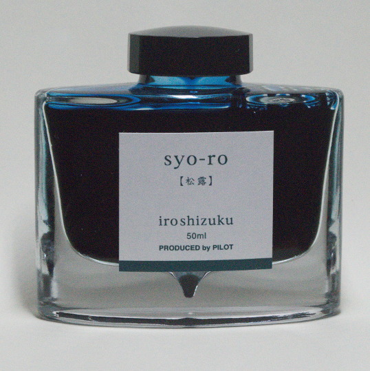
Pilot iroshizuku syo-ro ink (pine tree dew or gray turquoise)
People give me Amazon Gift Cards for Christmas and my birthday – which is a good thing because I can’t hope for anyone to understand my odd and ridiculous tastes. The final box I ordered for my birthday arrived – taking over a month, probably because it was shipped from Japan.
It’s a fairly expensive ink, but that’s the idea of a gift card anyway – buy something you really like, but would be too dear for you to buy for yourself.
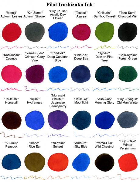
I wanted a new go-to color of ink and pored over the iroshizuku color charts to try and find the one I like the best – a sisyphean task. I wanted a dark color with subtle shading.
You see, once you start writing with fountain pens, you realize the quality of the writing experience depends on three primary variables. Everybody talks about the pen – people pay big money for fine pens. But the paper you write on is equally important. Some pens do better with some papers. And finally there is the ink.
Not only the color, but the qualities of the ink. Some ink works better in some pens, and the relationship with the ink and the paper is very complex.
Now I had my ink after its long journey on a slow boat. I love the bottle. Its a heavy, curved piece of glass art, with a cool little well at the bottom, to help get the last drops out.
After a little thought, I cleaned out my favorite Parker “51” and loaded it up. The ink and pen go together perfectly. It is a sweet luxury.
How does George R. R. Martin do his actual writing?
Using a separate computer for writing is brilliant. I wouldn’t go back to Wordstar – I’d use Wordperfect 5.0 – the best word processing program I’ve seen.
I like his rant against auto-correct – “If I had wanted a capital, I’d have typed a capital.”
I have no sympathy for Mesquite in this deal. I lived there, years ago, when the DART vote went down. Mesquite voted no. The reason I heard was, “If we get a train and a bus system, poor people will move here.” Wrong. Young professionals that work downtown and are looking for affordable housing will live there and take the train to work. And when the young profesionals move to other suburbs (with dense, transit-oriented development) what do you have left?
There are plenty of bad spots in Dallas. Here’s one that I particularly abhor. It would be a very useful route to get from Downtown/Cedars to the Santa Fe Trestle Trail… if it wasn’t a death trap. It looks like there are sidewalks and stairs too – don’t be fooled, they go nowhere… fast.
You all know (or should know) that I have a weakness for and love of fountain pens. I am primarily a “user” rather than a “collector” – but still appreciate an aged and well-done writing instrument, as long as it has a nib.
I was looking at Amazon.com for some stuff and, off in the corner, I saw an ad that caught my eye. Usually I ignore web ads, but this one seemed aimed right at me.
It looked like The Parker Pen company, the venerable company that over the years has produced such legendary and wonderful fountain pens such as the Vacumatic and the Parker “51” has come up with a new pen – maybe some sort of advanced nib, or a revolutionary filling system. I was stoked.
So I clicked through the ad to the Parker Ingenuity, one of their “5th ink technology” pens. Something didn’t quite look right. So I did some digging and research and it didn’t take long for me to figure it out.
This wasn’t a fountain pen at all. It’s like a felt pen, with a metal hood stamped around it to make it look like a fountain pen.The actual writing surface is replaced with a new refill. It even has non-functional ribs to look like the ridges on a fountain pen feed. A typical model costs a little bit under two hundred dollars. It is obviously aimed at people that want to look like they carry a fountain pen – they want the cachet – but that don’t want inky fingers.
I know that you are going to get ink on your hands or worse when you carry a fountain pen. A pen with a nib is considered a “controlled leak” and I’ve learned to wipe off the pen and clean the inside of the cap when a pen has been lugged around where it can get a shock and shake ink out into the cap. Flying is a real problem – the reduced air pressure can cause a pen to spew ink (I carry an empty pen, an airtight case, and extra cartridges).
So I fully understand someone that wants to carry, for example, a rollerball – sometimes I think of it myself – though I say no… it seems unclean somehow. What bugs me is that they make it look like a fountain pen. A triangle with a slit in it is not a nib – a good nib is a wonderful piece of design, engineering, and manufacture. It is a delicate mechanism of steel, gold, and iridium designed to deliver a carefully controlled stream of ink in a smooth flow to a piece of paper.
A felt pen is useful and deserving of its existence – but don’t try to hide it behind a stamped piece of sheetmetal.
Oh, one other point – I am not a fan of pens that have metal sections – the part right in back of the nib, the place where your fingers grip. I don’t like the feel of cold chrome. Warm plastic, rubber, or ebonite is a better writing grip.
Now that I’ve ranted a bit… if anyone actually wanted to buy me one of those… well, that would be different.